 Telegram
 8 Anti-Trends in Web Development to Avoid

Developers and designers usually discuss web development trends, but few of them pay attention to anti-trends. Their loss, because sometimes it is useful to see the wrong ways of making websites and web applications.
Anti-trend features can scare visitors away, give the impression of cheapness or bad taste, and degrade the user experience on your website. It is advisable to avoid these features or use them minimally and with caution.
Table of Contents
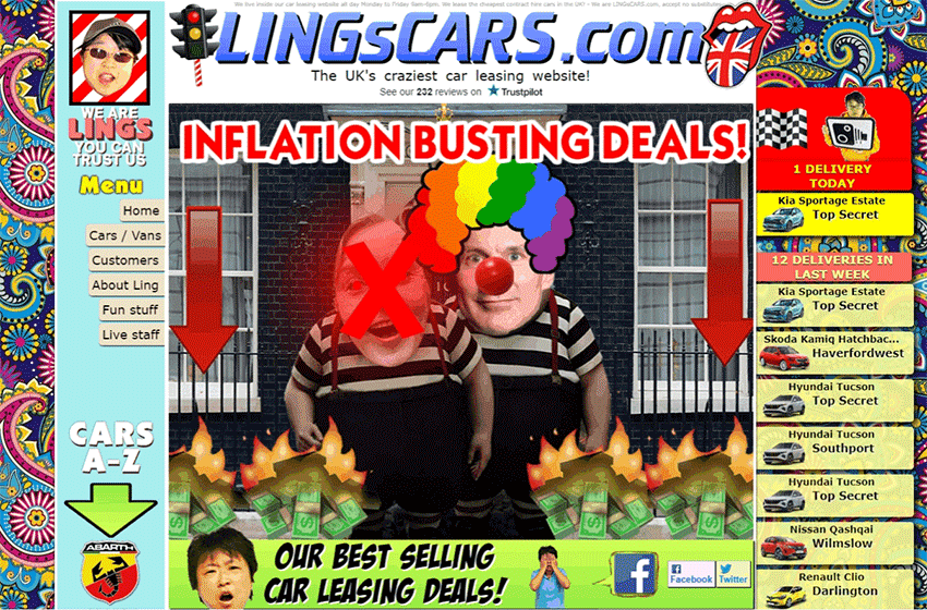
You shouldn’t overload the interface with a lot of complex images, 3D models, animations, videos, as well as huge fonts and decorative elements that can be dispensed with. They will make a website look cumbersome. And it will also work slowly, because the abundance of graphics requires long loading.
As a rule, inexperienced designers and layout makers create overload when trying to show all their skills at once. Instead, it’s better to do with only the essentials, as well as make the indents between elements.
If you are a customer and ask to place more accompanying illustrations on the pages of a commercial website, then note that this may worsen the conversion. In such cases, you need to create dedicated landing pages.
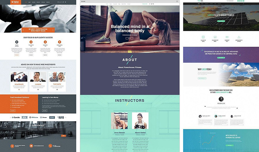
You shouldn’t use too many colours in your design. 3 colours and several shades of them are enough. Today, natural colours and calm shades are preferred, rather than very bright ones.
Colours in the design should be distributed evenly: a couple of primary colours for the background and text, plus one accent colour to highlight important elements and style some details. The latter may contrast with the background.
Possible exceptions for websites:
You shouldn’t highlight semantic blocks by colouring their background. The trend for such a practice has long ended. A page is easier to read when it looks like a single whole.
Instead of different background colours, separate the blocks with headings, appropriate illustrations (not abstract), and decorative elements.
If you still want to highlight some block, for example, an advertising one, then use an accent colour frame. Either make the background colour slightly lighter or darker there.
You shouldn’t use different colours in the gradient for any button to attract a user’s attention. A multicoloured button seems garish and gives the design a frivolous look.
The button looks neater when filled with a flat colour. But if you still want to fit a gradient button into the design, then make the colour flow smoothly into its lighter shade.
Sometimes the gradient is used for a hover effect: when you hover over a flat-colour button, it becomes gradient. In this case, it’s also better to use the shades of the same colour in the gradient. Either make it so that when hovering, a flat-colour button changes colour to a brighter shade.
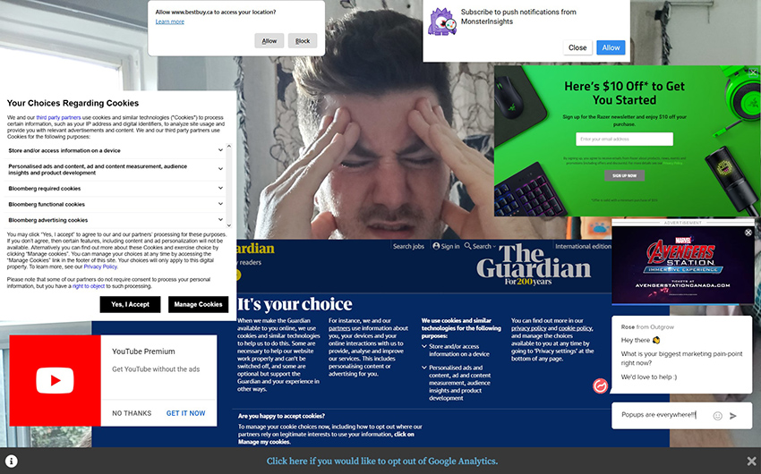
You shouldn’t implement pop-up and notification windows like ‘submit a request and we will contact you’ on every page. These windows only annoy visitors, especially if they come to read an information page or blog post. In addition, they burden a website, causing pages to open longer, since they are usually third-party plugins.
You can use pop-ups to convert a visitor into a buyer or customer on selling pages only. At the same time, it is advisable to make a button or link that the visitor himself wants to click in order to receive feedback. You can also insert a form with contact fields at the end of the selling page.
If you still need to attach a chat window, then configure it so that it doesn’t take up half the height of the screen and doesn’t overlap the content. Place the chat window in a corner and make it minimised by default. If desired, the visitor will expand it and write there when they have questions.
The burger menu is considered an anti-trend only when used on the desktop version of a website. If the menu has few sections, then there is no need to make it a burger with drop-down submenus. On a large screen, it will be difficult for a visitor to find this burger. Then, to get to any submenu, one has to perform an extra action by opening the burger.
An exception is possible for websites that have a lot of main sections in the menu, and it is impractical to make them nested in groups or place them elsewhere. Then the use of the burger menu on the desktop version will be justified.
For the mobile version of a website or mobile app, there are no worthy alternatives to the burger menu due to screen limitations. Although, here you can also do without a burger if you resort to one of these methods:
Horizontal scrolling will also not fit into the desktop version of a website. It may seem non-obvious to visitors who are only used to vertical scrolling of pages. Some won’t notice the bar or left-right scroll arrows, others won’t want to perform an extra action.
Horizontal scrolling on a website will be appreciated only by owners of laptops with touchpads and tablets. But it is difficult to implement such a feature specifically for them.
Even for the mobile version of a website or mobile app, there are few reasons to put horizontal scrolling to good use. Unless your web or mobile app shows maps, routes, schemes, etc.
A couple of years ago, auto-playing video on the background of a page was trending, but today this feature is nearly not used. Even in those days, videos were mostly inserted into the backgrounds of personal websites or blogs. Bloggers might find someone else’s relevant video or shoot their own on a regular smartphone camera and embed it without processing.
Unlike individuals, a company cannot use other people’s videos for its commercial website. Copyright owners won’t forgive such borrowing. And to shoot your own video materials, you need professional equipment and high-quality video editing, otherwise it will look unimpressive.
This doesn’t mean that you should avoid dynamic backgrounds. Instead of a video, it’s easier to create a GIF animation or CSS/JavaScript animation. Such a background will be more practical and will load faster. For example, look at the animated polygonal particles that move on the background of the first screen of our main page. Disperse them with the cursor — it is obvious that the video wouldn’t give such an effect.
